Pages

Sunday, April 06, 2008

Mid-Tone Contrast in B&W Portraits


As some of you may know I have been working on the refinement of the black and white conversion using the channel mixer. In this image we will be looking further into enhancing mid-tone contrast for increased clarity and sharpness. The image above is the before and after. Keep reading to learn the technique.


This is the original image straight out of my Canon EOS 5D using the famous 85mm F/1.2L Mk II lens. Even though it is quite slow the images has such clarity and feel that it is my favorite portrait lens. My son Iain was shot at f/11 1/160 at ISO50 using a single Alien Bee B800 with a medium 30x40 softbox camera left and a 2x4 white foamcore reflector camera right.


Next was the conversion to black and white. For skin tones the secret is the red channel. This setting enhances the contrast in the pinks of the skin for further definition. Be careful however since it can often reveal blemishes in the skin that are typically invisible to the naked eye. Play with it some and you will feel like you have X-Ray vision.


High-pass sharpening has become my standard practice over the last month or so. I like it because you can adjust your sharpness over the timeframe of the retouch because it is on it's own seperate overlay layer. Plus you can always run an unsharpen mask pass on it for even more sharpness.


This is my lightpainting/highlight compression pass. I felt the shin was losing some definition so I painted black on a 50% gray layer to bring down the highlights to further compress them to the midtone gray.


For me the shadow/highlight tool (image/adjustments/shadow/highlight...) is the most powerful image toning tool since the levels tool. I love the variety of looks you can get with it. Seen above is the advanced tool set. You really need to do a good bit of experimenting with every image to get the look you are searching for.


This is the image from above minus the shadow/highlight menu.


This is the final image with a film grain overlay and some minor leveles adjustments.


Here we have the final image with all the layers used. Not the highlight compression layer, and the midtone contrast layers... pretty cool.

You can also get involved in further online discussion concerning this image at Fred Miranda at this link: http://www.fredmiranda.com/forum/topic/633458/0.

________________________________________

Thanks for visiting and I hope that you learned something new. If you find these walkthroughs valuable please donate a few dollars at the link to the right. Your support and contributions are most appreciated.

Monday, March 24, 2008

Some recent retouching work

Here are a few projects I have done over that last few days.


This corporate portrait was taken by Liam H. of the United Kingdom and was part of an interesting discussion on HDR (high dynamic range) portrait photography. I did this retouch as an example of what was possible just in retouching to expand the dynamic range using the shadow/highlight tool, light painting and the use of the levels tool.

You can follow the on-going discussions at http://www.fredmiranda.com/forum/topic/627881/1#5563023.


This image is by Norman Wilson of Norman J. Wilson Photography in British Columbia. Once again the shadow/highlight tool heleped to expand the detailes in the black regions of the image and re-capture some of the details lost in the lighter areas. It really gave the silk shirt alot of shine and texture. I also utilized my 50% gray layer light painting method to further give the shots a real painterly feel.

See more of Norman's work at njw.ca or you can see discussions regarding this image at http://www.fredmiranda.com/.

Tuesday, March 18, 2008

Audi R8... or should I say RS8?

The new Audi R8 is a great car all around. But as usual I feel that the styling on most new cars could always be taken a little further. This is a typical chop where I applied my usual list of modifications including:


This is the before image courtesy of seriouswheels.com


This is the after image with the following modifications:

  • Lowering the car's suspension to lessen the gap from the top of the tire to the wheel wells.
  • Chopping the roof height by compressing the distance between the top of the hood and roof.
  • Stretching the side rockers to get them closer to the ground for a more agressive stance.
  • Adding an additional front lower valance piece to give the vehicle more ground effects and a more agressive look.
  • Gun metal gray-out the wheels.
  • Tint the windows.

This is an interesting view I came accross when disabling layers for this walkthrough. Here you can see the overlay layers for the front and side aerodynamics pieces as well as the tinting for the wheel, windows and grills.

Sunday, March 16, 2008

Building a Ghostly High-Key Image

I have been researching high-key photographs for quite a while. As many may know, I tend to lean more toward the dark side in my imagery so I was especially intrigued by challenging myself to do something that was predominantly white.

According to wikipedia, high-key lighting is a style of lighting for film, television, or photography that aims to reduce the lighting ratio present in the scene. High-key lighting is usually quite homogeneous and free from dark shadows.


In keeping with this as my guiding principal the ratios on this shot are all the same metered from left, front, right, and top. The background was 1 stop down from F14 metered from all the other locations. As seen above, I used 3 lights and a few reflectors to achieve the image. I used a Canon EOS 5D shooting RAW with the 85mmII f/1.2L lens... may favorite for portraits.


This is the original shot straight out of the camera with only minor color balance and exposure corrections made in the Adobe RAW importer.


This shot shows a minor level adjustment to wash out the background just a bit more. In retrospect I probably should have shot the background 1 stop up from everything else.


I love the channel mixer for black and white conversions. It creates such nice smooth texture and tonality based on the RGB values in the shot. Here you can see the numbers I used.


Here you can see the layers used in the construction of the final image. A pretty simple project IMO. It really boils down to starting with a nicely shots image to start with... and good talent that will do as instructed. My goal was to truly highlight the eyes and you can see how I did it with a series of white vignettes and my light painting layer.


And here we have the side-by-side comparison of the original with the final image. Thanks for visiting and please leave comments.

Friday, March 14, 2008

Svetozar's Sister

Svetozar Stefanov is a contributing member over at Fred Miranda and he shot this great image of his sister. It was discussed on the forum at FredMiranda.com that the skin tones were on the orange side.

I focused first on the white balance using the levels tool and the mid tone eyedropper. I just picked a few tones that i though made the skin look a bit more natural and ended up with what you see below. I also did some work with light painting to even out the exposures and further focus the eye on the woman's face by reducing brighter elements in the shot.


This is the before and after comparison.


This is the after shot all by itself.


Here we have a black & white conversion made using the channel mixer... my favorite.


And finally we have a screen capture of all the PhotoShop™ layers used in making the shot. You can see the various layers labeled as to their function in the retouch.

See more of Svetozar's work at photo-journal.net/

Thursday, March 13, 2008

Smoothie King Print Ad

I recently worked on an extensive photo retouching/compositing job for my friend Jim Arbogast... a great people photographer. The project was for Smoothie King and the advertising agency St. John and Partners based in Jacksonville, Florida.

Jim and I were trying to recreate the surrealistic look that has become quite popular in today's photography, especially in print advertising design. Jim shot on location in 40-degree weather with over a dozen scantly clad models. The set-up was quite impressive with many strobes set-up in various locations to get the hard rim lighting which is imperative in this surreal look.

After about 4 hours of set-up and light testing they shots the frames they needed by mixing various models in different locations knowing that in post-production we would be able to combine frames to get the best expressions for the final composite.


Above is the starting frame. As you can see there are a variety of challenges to overcome but because it is a well staged and lit shot there is much potential. First and most obvious was the dismal sky which was to be completely replaced. Next was the palm tree that due to the incliment winter weather was in pretty bad shape.

Other major issues included the un-even sunlight as you can see a pretty serious shadow cutting accross several of the models in the midground. By using a combination of exposure curves, lightpainting and color balance correction I was able to even everything out.

The client also had many specific requests for changes in what models from which takes were placed in the final shot. the girl in the pool leaning over the side was the first to be replaced followed by the three ladies in the lounge chairs in the middle of the shot. Several other takes were used to add people in the far background to the left and various other places in the shot... see if you can find them all.


Above is the final print ad with ad copy and Smoothie King logo. As you can see all the issues in the original shot have been fixed along with several other minor color and level corrections. All in all everyone with Smoothie King and the agency, St John & Partners, were very happy with the results and I would like to wish them success with the campaign.


This shot is the director's cut of the image. Jim and I prefered a previous version of the compisite where we used a sun and different variation of the clouds in the sky. We also wanted to further pump the mid-tone contrast for a bit more surrealism. In all I spent close to 15 hours working on the shot.

Please check out more of Jim's work at http://www.jimarbogast.com/. You can also find more work from St. John and Partners at http://www.sjp.com/.

Monday, March 10, 2008

Beautiful Skin

I wanted to work on some skin smoothing technique refinements. See if you can see the difference in these two shots.

This is before.


This is after.

This is a before and after.

Sunday, March 09, 2008

Lightpainted BMW 335i

This was an experiment that I have been wanting to do for a long time. My good friend, fellow photographer and car lover Ken Volpe (see his amazing work at Transposure.com) and I had been discussing a car calendar project for a few years but never could figure out an easy, portable and affordable solution to shoot cars in the style in which was envisioned.

The challenge was to get the look of a large softbox in a studio without the softbox or the studio. In my research I discovered that shooting lighter colored cars (red, yellow, white, etc...) was fairly easy because the lighter colors would radiate light however; when you got dark cars (black, grey, etc...) which I personally prefer, you were left with only reflections.

I did several tests on my Atlas Gray Porsche 996 Turbo and Sparkling Graphite BMW 335i using strobes but none of theses came out the way I had envisioned. So I had to try something else. I had read about lightpainting and actually did a test using a 1,000,000 candle power flash light with interesting result. I was not getting that broad reflective surface I needed for the smooth, flowing reflections.


This is my Porsche 996 Turbo lit using a flashlight. Several exposures were combined to create this image.

While talking about my dilemma with friends and professional gaffers Jaye Kenyon and Jason Maresch, (click here to visit their company High Contrast Lighting) they mentioned using a KinoFlo tube and that got me thinking. The 4-foot tube would perhaps give me the amount of surface area I was looking for if shot over a long exposure. He let me borrow one so I could try some experiements.

With Laura, my wife and son Iain we went out in the driveway at around 8:00 at night... pitch dark this time of year, and we set-up the tripod, plugged in the kino-flo tube and started shooting. The magic exposure numbers were at f/18 for 15 seconds. After 5 or 6 shots I realized that I would need to combine multipe exposures to get the reflective coverage I was looking for.


This is the primary exposure. You can see my blurred image walking behind the vehicle.


This is the secondary exposure where I walked in front of the car. See the cables and balast for the kino-flo.


This is the two exposures above combined. The second is at 50% opacity and screen overlay.


Here's the mask used to paint out the background elements including myself.


Here's the resulting image after the trash matting.


After some additional level adjustment to finalize the background clean-ups.


Here are the photoshop layers.

If you like this image and would like to purchase one for yourself, please click HERE to order yours today.

Tuesday, February 19, 2008

The Hand of Hands


This was a fun little experiment I did after seeing an example online. The trick is to shoot the mini hands at the correct angle which requires a bit of planning. I did not do it 100% right in this exercise if you look at the shadows but it gives it a bit of a surreal appearance.

Monday, February 18, 2008

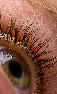
Eye macro

I love to shoot eyes and once again my son Iain was my model. As a member of http://www.deviantart.com/ I get tons of inspiration from the many talented artists there. This is a shot inspired by the shot found below at this link: http://ketutita.deviantart.com/art/eye-27513785.

This is the inspiration shot.

I placed a medium softbox about 15 inches above Iain who was laying in the ground. I used a f/2.8 100mm Macro on a Canon 5D and shot as closely as possible. In post I did a good bit to enhance the contrast, color and contrast.

Here's my finished shot.
Here's the before and after showing the enhance clarity and contrast.

Sunday, February 17, 2008

Fun with gels

Wanted to experiement using my new Sekoniq L-758DR light meter. I felt that doing something clever with gels would be fun and Iain (my son and always willing test subject) is always up for something a bit different.

I started off with a standard 48" roll of paper on a c-stand. Next came an Alien Bee B800 on my overhead light system. Iain picked the gel color and I clamped it on. Then to get a dramatic lighting on the boy to compliment the direction and mood of the shot I placed the main light just under his chin shooting straight up.

I used the L758 to meter and adjust the light rations and took about 8 shots... this one being the best combination of expression and angle.


Here's the final shot. Did the usual retouch job for extra punch.

Wednesday, February 13, 2008

More Portrait Retouching

Here's another shot of Mikhail's that I did work on. this beautiful face on portrait took about 15-20 minutes to complete and utilized many of the same techniques detailed in the overview below. Enoy.


Here's the before & after.


Here are the layers in PhotoShop.

Sunday, February 10, 2008

Portrait Retouching

This is work I did for Russian Photographer Mikhail Parokhadov. This lovely young lady needed retouching to repair minor skin blemishes. I also did a bit of work with lightpainting to enhance shadow detail and even out a few hot spots on the forehead and cheek.


Click this image to see a full-size before and after comparison.


Click this image to see a detailed layer walkthrough explaining the work done to this image.

Online discussions regarding Mikhail's photography session can be viewed at Fred Miranda at http://www.fredmiranda.com/forum/topic/613871.

You can also see more of Mihail's work at http://www.photostudia.spb.ru/gallery/.

Thursday, February 07, 2008

Wondering Design Logo and Business Cards

I just finished design work for Jeff Hunter and April Miklas of Wondering Designs. These guys provide cutting edge internet experience design and are young visionaries with an eye on the future. The challenge was to come up with a fun, organic and stimulating logo and corporate identity that echoed the spirit of Jeff and April's vision.


This is the front and back of the business card design.

Please visit Wonder Designs at http://www.wonderingdesigns.com/ to see how my artwork was cleverly integrated into their web design work and see lots more of the projects they are working on.

Wondering Designs is a collaborative design partner with Digital Video Arts and Astounding Images.

Sunday, February 03, 2008

M Roadster Poster Design for Gordon Buckland

During Cars for the Cure on February 2nd, I met BMW officianado Gordon Buckland. This witty Australian had an insanely modified M Roadster that I felt was definitely worthy of a killer poster. Below is the final design. We are sorting out matting and framing options but this is sure to be a gorgeous piece once finished.

This is a conceptual visualization of the proposed matting and framing for the finished piece.


This is the full-size finished print.


This is the before and after.

See images from Cars for the Cure 2008.